goodhabits - Responsive Web App UX & UI Design
My Role
UX/UI Designer
Tools
Figma, Miro, Keynote, Excalidraw, Google Sheets, Marvel
Time
2 months during the Career Foundry UX Immersion course
Objective
This project was created during the Intro to UX Immersion course as part of the UX Design program I took with Career Foundry. The goal was to create a responsive web app that enables people to improve their health and well-being.
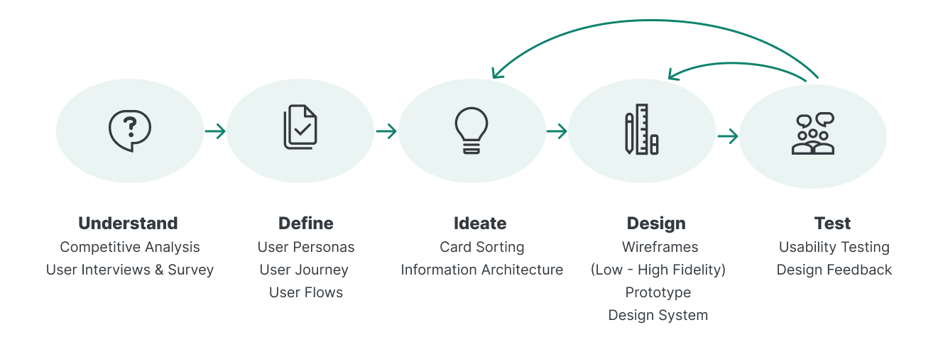
Design Process
Problem Statement
People need help to better understand how to improve their (physical and mental) situation and build consistent and informed healthy habits because they want to increase their overall health and well-being.
We will know this to be true when people are engagingly using the app, are gaining knowledge of their own health and habits and are able to implement health-improving changes into their everyday lives.
Possible Solution
An App that takes recent findings on health, well-being and habit building into account and helps users to inform them about their health as well as set & track personal goals.
A broad library of meditations, yoga and exercises will make regular movement and mindfulness easy and accessible.
Understand
Competitive Analysis
I wanted to understand and learn what solutions are already out there, what are their strengths and possible weaknesses, how can my product stand out? To get answers, I looked at the market identified and two main competitors, Headspace and feel better. Analyzing them, I discovered opportunities for goodhabits in the current market.
Competitor 1 feel better
Overview
feel better is an app that aims at improving the users’ overall wellbeing and health. It covers a broad variety of recipes as well as mindfulness, meditations, yoga video classes, workouts and a tool to track the user's habits. The company behind it, deliciously ella, is well known for its best-selling cookbooks, a successful podcast, a restaurant and 2,1 Million followers on instagram. The preexisting base of (potential) users is also their biggest market advantage.
Strength
Big existing customer group, well known
Covers a lot of areas that contribute to health
Relies on scientific discoveries of what contributes to well-being and health
Great recipe
Motivating tracker, focusing on positive habits instead of negative things like stress levels (without relying on overruled concepts like calories)
Very competitive pricing
Opportunities
Better structured IA
A very intuitive to-use product
Better availability and ability to browse/search for information and articles on topics of well-being and scientific findings
A bigger focus on habit building (eg. setting reminders, a more prominent tracking tool)
Functions that can be easily personalized
Weakness
Does not communicate/inform well: information/articles are badly structured, not able to search the “learn” section
Confusing and complicated Information Architecture
Meditations can’t be saved under favorites when open - they have to be closed (can’t be saved at all when accessing through the search)
Confusing choice of words/labels, eg “self-care” = face massages
Not possible to personalize the tracker
Threads
More intuitive to use products with similar topics
Products with a heavier focus on successful habit-building
Apps with well-thought trough and tested IA & UX in general
feel better UX Analysis
Usability
Basic menu sections are clear and understandable
However, some specific sections are rather complicated and not always easy to navigate trough
Specific functions are not well thought trough
Navigation Structure
Finding or searching for specific things eg an article on a topic or a certain ingredient is complicated.
It is not possible to search in different sections (eg searching for a week-plan for sleep) even though the search button suggests it, the whole app is being searched - which is frustrating
Saving items to favorites is not always possible
Differentiation
feel better is a successful app with satisfied users and profits from the well-known company behind it.
But there is still room for improvement: some features and the overall organization seem a bit neglected.
This might be a chance for our product to be competitive: by building a very intuitive, easy-to-use tool with a good knowledge library and a bigger focus on successful habit-building.
Layout
The app has an overall pleasing and beautiful design concept
Elements are consistent throughout the app
The information structure however is in some parts confusing
Compatibility
Even though a responsive web app exists where you can log in, it is clear, that the main focus is on the native app Some elements are missing.
The native app is available for Android and iOS
Calls to Action
It is possible to sign up for a newsletter (the process is easily understandable and straight forward)
Competitor 2 Headspace
Overview
Headspace is one of the best-known meditation apps, offering a variety of meditations on different topics, most of them focusing on the breath. The meditations can be adjusted by length and the instructor’s voice can also be changed for most meditations. They also offer yoga videos as well as workouts. Users can track their stress and anxiety levels. They attempt to stand out with a pleasing UI with calming animations and meditation collections on different topics. Some weaknesses include a tracker that can not be personalized, an uninformative way of displaying time meditated and some confusing categories.
Strength
Well known an established
A growing offer on different topics for meditation, yoga and workout
The ability to adjust different meditations to the user’s need by being able to change the length and the noise of the speaker
Beautiful and calming illustrations and animations
Beautiful UI elements
Opportunities
Creating a motivating, personal area where the user gets inspired but not overwhelmed and where progress is shown positively
Better/broader ability to track different areas
Overall including more aspects of well-being and health
Adding more informative material
Including habit-building tools
Weakness
Rather expensive and inconsistent pricing
Tracking of moods might have a negative focus on levels of anxiety and stress
Not possible to personalize tracking/track other areas eg. sleep, nutrition goals etc.
The overall progress is displayed in „minutes meditated“ - this is rather useless information for the user
Threads
Apps that integrate more areas of well-being
Products that are overall easier to use and more motivating
A motivating yet informative tracker
I now understood the market opportunities for goodhabits:
An app focused on a broad approach to well-being
A focus on habit-building and knowledge
Intuitive IA
A tracker that is motivating and informative with goals that can be personalized
make features easy to personalize and adapt to users’ needs
User Interviews and Survey
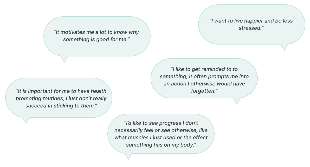
A user survey with 7 participants and 4 user interviews were conducted with the goals of understanding the users’ interests in health and well-being, getting to know their habits, documenting their frustration and delight with current tools as well as gaining insights into their motivations, frustrations and needs. I organized the data by affinity mapping to identify the main insights.
My key takeaways from the interviews and the survey:
All participants were interested in having a place to get valid information/articles to educate themselves on scientific findings on different health-related topics
All participants found it important to create health-promoting habits
The interviewees all had different things that motivate them to create/stick to a health-improving habits
Reasons not to exercise or meditate included a lack of motivation, a busy life or participants simply forgot
Define
Personas, User Journeys & User Flows
To be able to solve the users’ problems, I needed to really step into their shoes. Meet Liz and Tom!
They represent the findings from the user interviews and helped me to design a useful product.
LIZ
„Gaining knowledge about the effects of habits and health would be very helpful, so I don’t have to rely on my sensations only.“
About
Liz loves her weekdays but they are busy with work and taking care of her two kids with her husband Gary.
She has some habits that she succeeds to stick to, as her back pain reminds her to work out. She would like to reduce her stress levels too and work out regularly even when her back does not hurt.
Age
Pronouns
Job
Status
Location
33
She/Her
Architect
Married, 2 Kids
New York, USA
Goals & Needs
Implementing health-promoting habits that last also when she feels healthy
Set personal goals and get help on how to reach them
Because her days can be demanding and busy, she wants to learn to feel less stressed
Frustrations
When her back doesn’t hurt she doesn't succeed in sticking to her routines as her busy life but also her laziness keep her from doing so
She is generally interested in health topics but looking for reliable sources of knowledge takes a lot of time. Due to her busy life, she is frustrated with this.
Motivations
Feels more motivated when she understands why a habit is good for her
Seeing overviews of how much she has already accomplished motivates her
Little reminders help her to stay on track
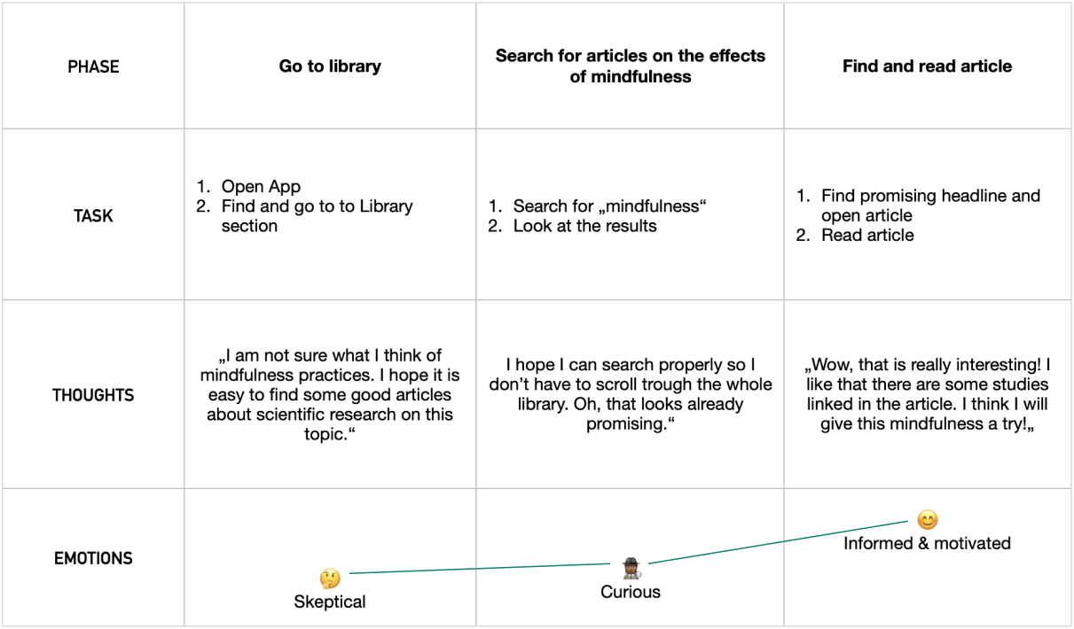
Liz’ User Journey
Searching an Article
Liz’ User Flow
Searching an Article
TOM
“If only I knew what helps me to stick to my routines!“
Age
Pronouns
Job
Status
Location
25
He/His
Web Developer
Single
Köln, Germany
About
Tom is a young adult who just started his exciting work life a year ago. His day-to-day life is always changing since he has no fixed working hours and likes to be spontaneous.
He tried different things to create lasting habits but didn’t succeed and is now very interested in the science of habit building as well as scientific findings on health and wellbeing.
Goals & Needs
Understanding the science of habit building
Gain knowledge about mental and physical health
Create long-lasting habits that improve his physical and mental wellbeing
Frustrations
Has difficulties to create habits as his every day life is very flexible and changes often
Has tried different things and apps but does not succeed in creating long lasting habits and routines
Failing his goals demotivates him
Motivations
To compensate for sitting at his desk the whole day he wants to work out regularly
He wants to stay healthy
He wants to live happier and be more present in the moment
Tom’s User Journey
Activating a Plan
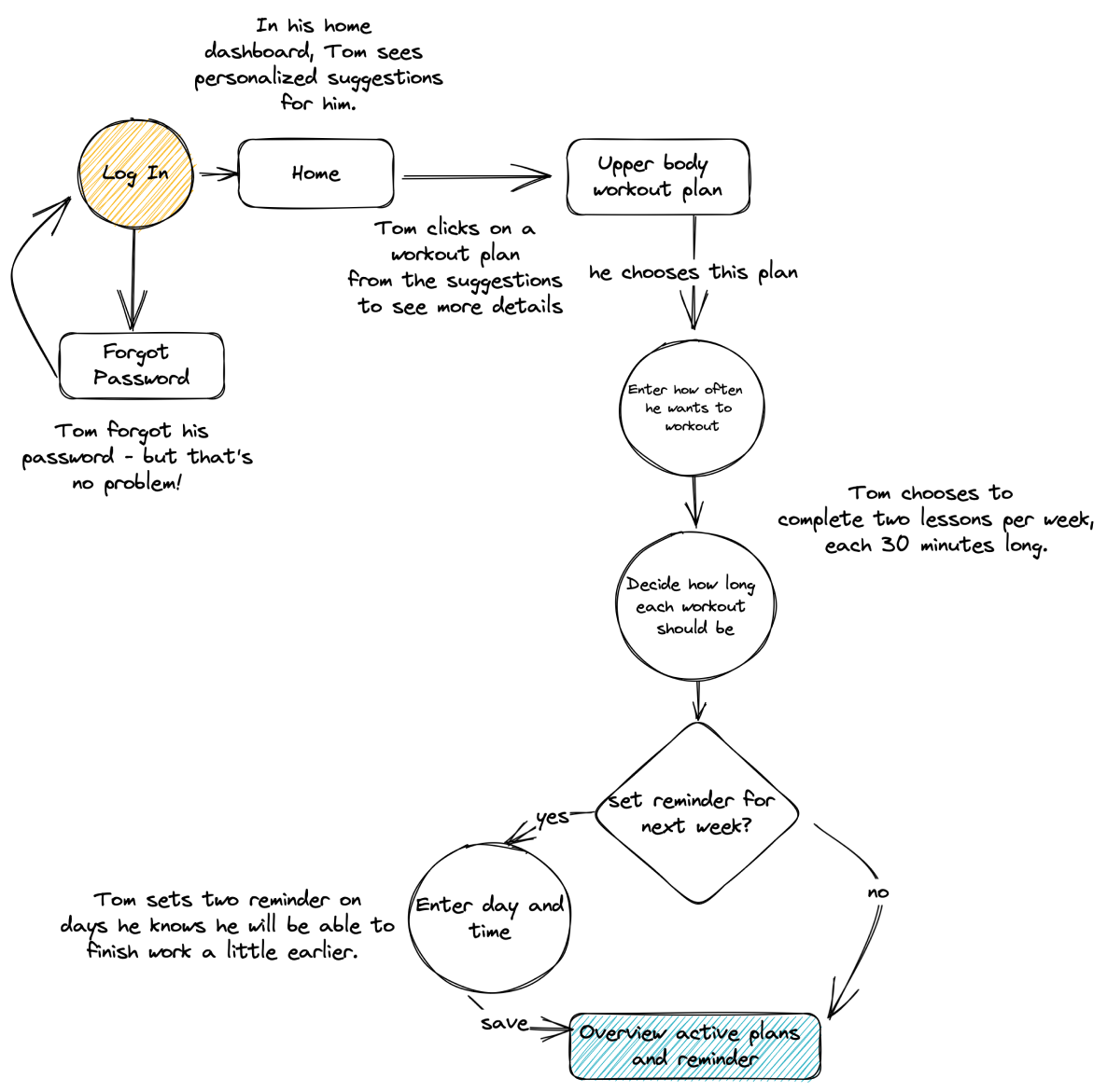
Tom’s User Flow
Activating a Plan
Creating user personas gave me a better and deeper understanding of the findings from my interviews and made them less complex. Through the user journeys and flows, I got a first idea of how users would navigate through the app and what features it would include.
Ideate
Information Architecture & Card Sort
It was time to roll up my sleeves and get working on the Information Architecture! While creating a first draft of a sitemap I struggled with the creation of categories - I saw many possible options and none stood out to me. It was again time to get into the minds of potential users. I conducted an open card sort with 6 participants and updated the sitemap accordingly.
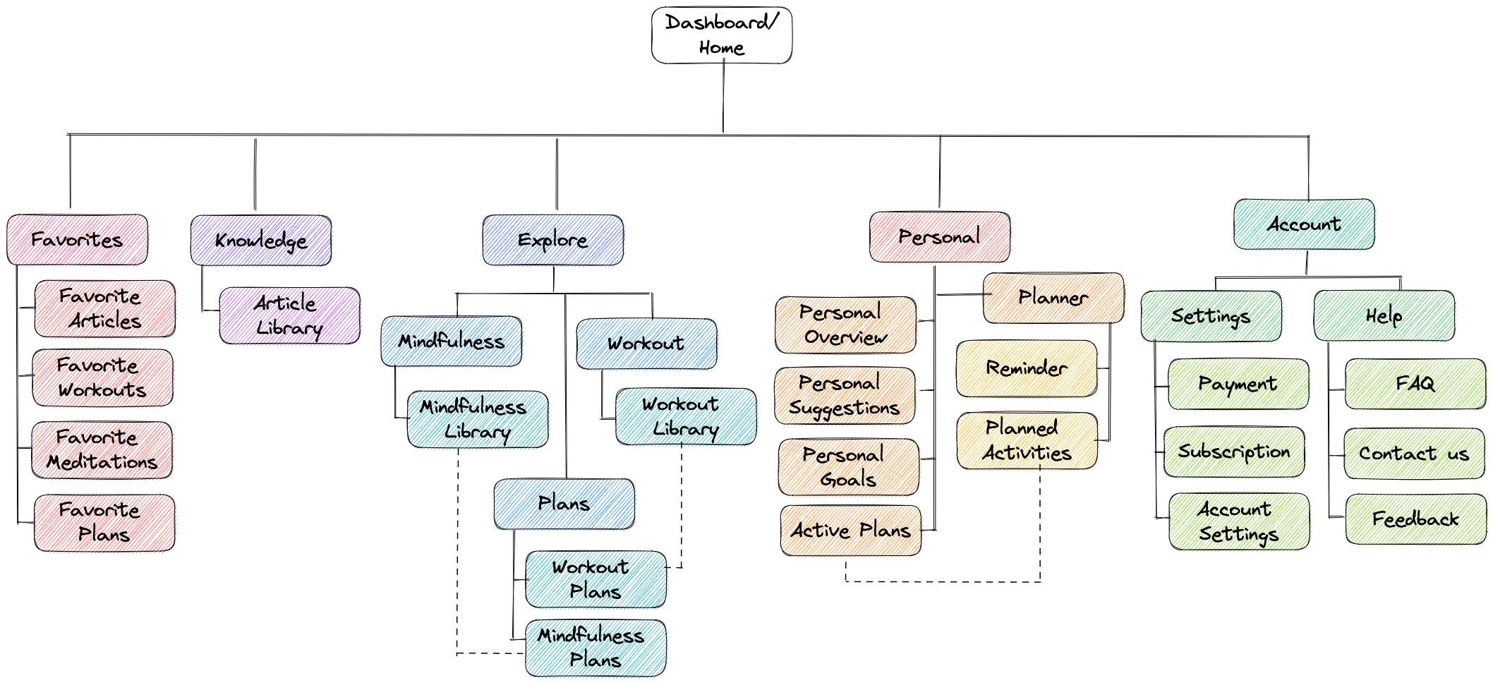
Updated Sitemap
The card sort helped me to get a better understanding of the users’ possible mental models. Most categories from my initial sitemap were recreated by the participants and I did not need to make many changes in the end. The category “personal” varied the most in the card sort, so I kept it simple for now and kept an open mind about it.
Design
Wireframes
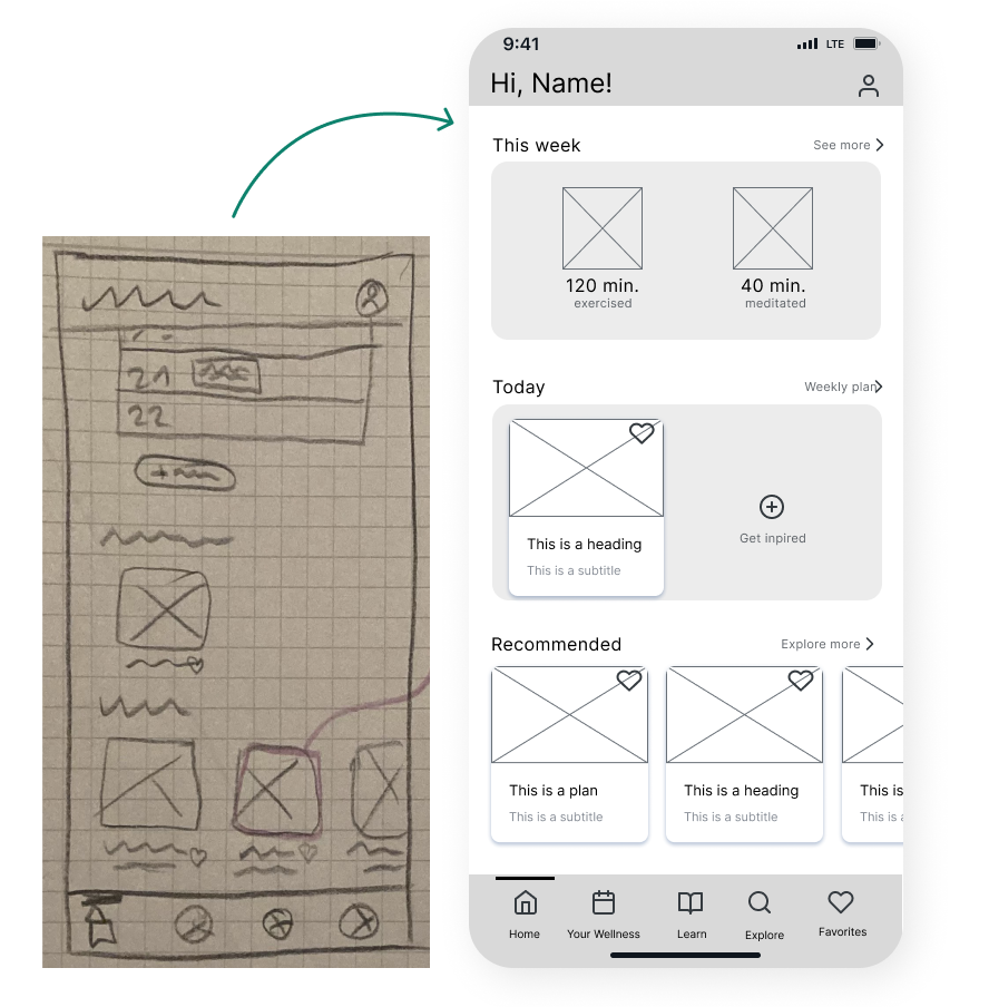
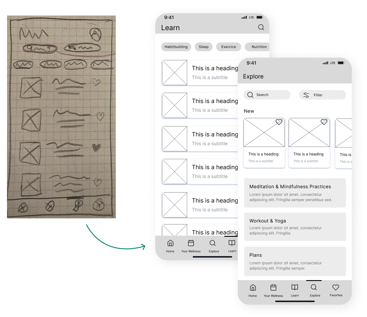
At this stage, I started sketching the first screens of the app with pen and paper to quickly bring different ideas to life and test out the layout and parts of the screens. These then turned into digital mid-fidelity wireframes which I turned into a prototype using Figma.
Home/Dashboard
Originally, the Dashboard was scrollable, containing a lot of information and representing the “personal” category of the card sort. I reduced the contents displayed to not overwhelm the user and to make it easier to make decisions and take action. It now serves as a Dashboard with easy access to all relevant sections/features of the app. The additional category “My Wellness” now contains more personal information.
Learn & Explore
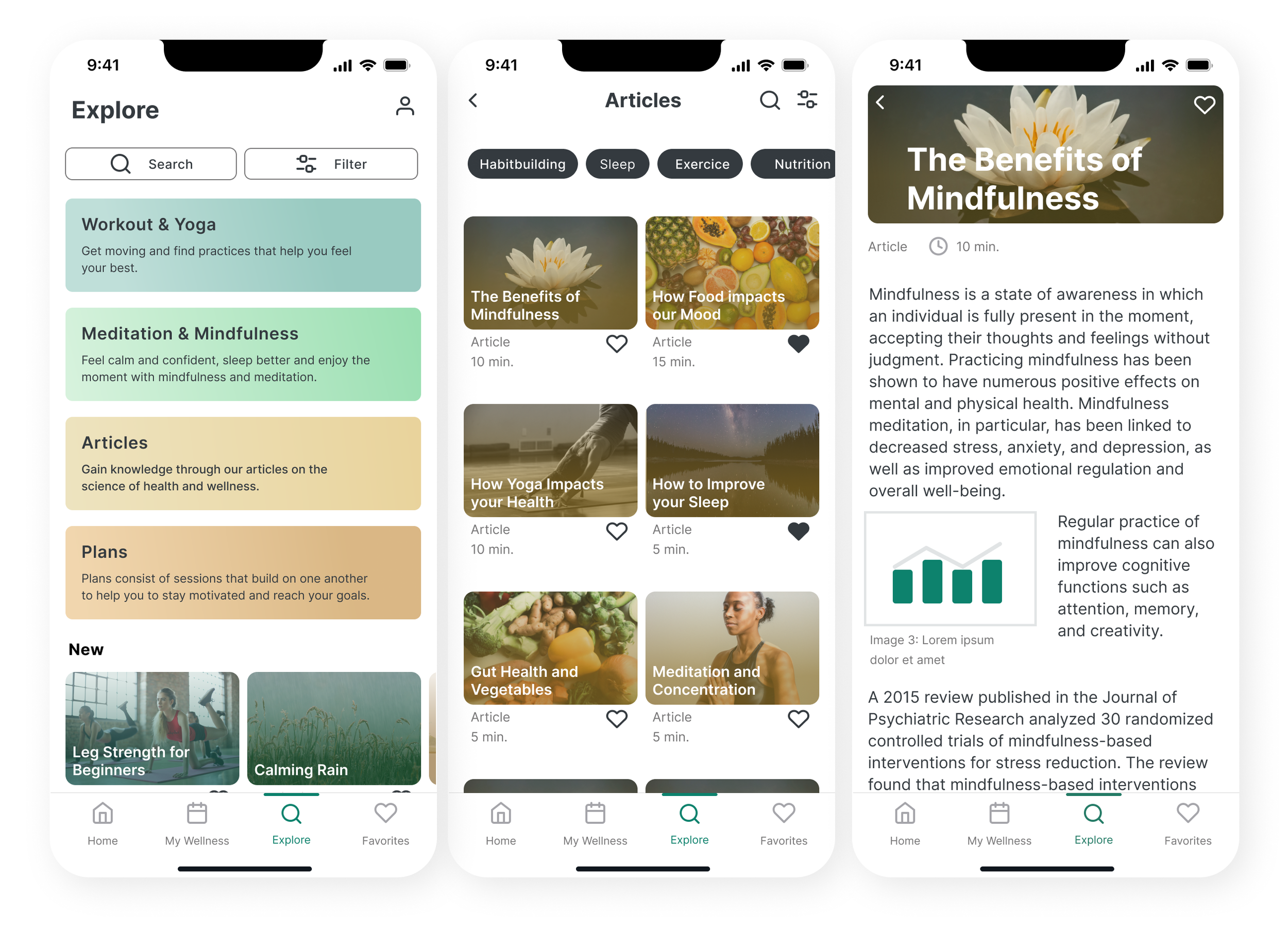
The “Learn” section included articles so the users can gain knowledge about their health and habits. The Explore section included all activities of the app: workouts, yoga, meditations and plans. Keep an eye on them, as the next step changed these quite a bit!
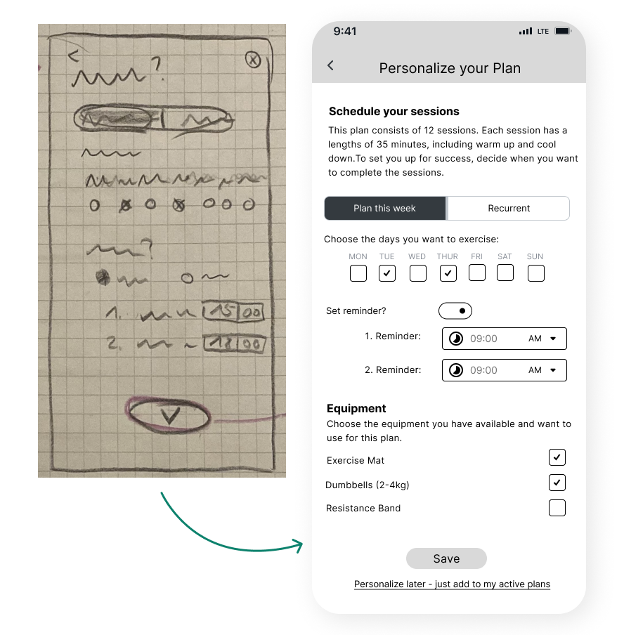
Scheduling a Workout-Plan
This screen was one of the most challenging ones. I learned that making things easy and intuitive actually isn’t that easy and intuitive. It often requires a lot of work thought and - most importantly - feedback from users. Let’s get to the usability tests!
Yay, the project and ideas finally came to life! But I soon realized in order to not make assumptions on how to design things best I had to, you guessed it, test it with potential users.
Test
Usability Tests
Time to see how potential users interact with the prototype to find out what works well and what issues they might face. Equipped with my usability test plan and usability test script I conducted 6 moderated usability tests using the Think-Aloud method. Among other small changes, I discovered 4 issues that were rated with mid to high severity and therefore adjusted.
Issue 1: Finding an Article
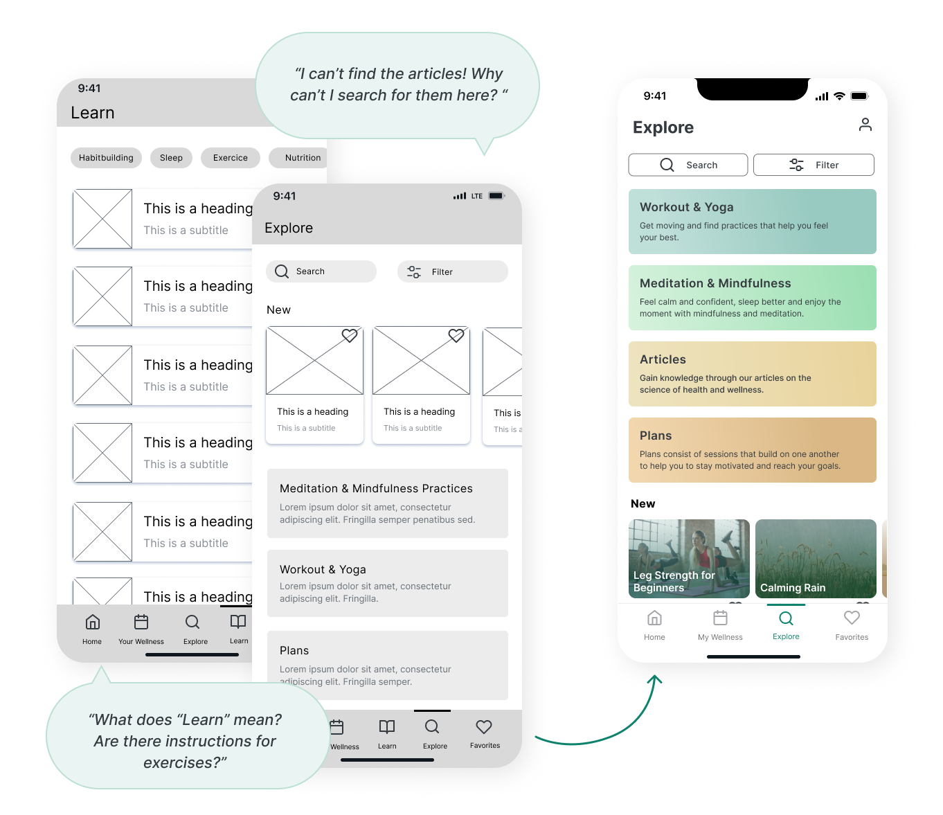
During the usability tests, I asked the participants to look for an article on a certain topic. All tried to find them under “Explore” and were frustrated they could not use the search there to search the whole app. Some even needed assistance to understand the category “Learn”. This was a high-severity issue and I solved it by renaming “Learn” to “Articles” and including it in the Explore section.
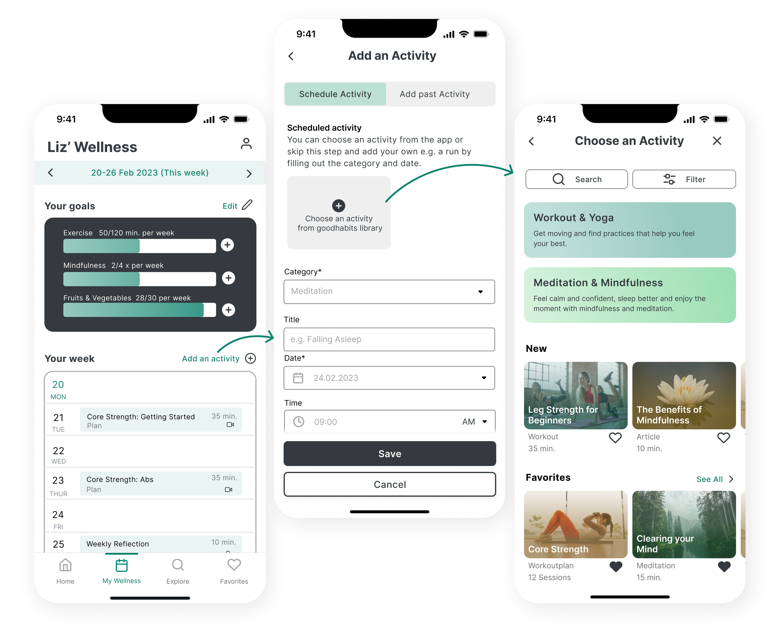
Issue 2: Adding an Activity to the Planner
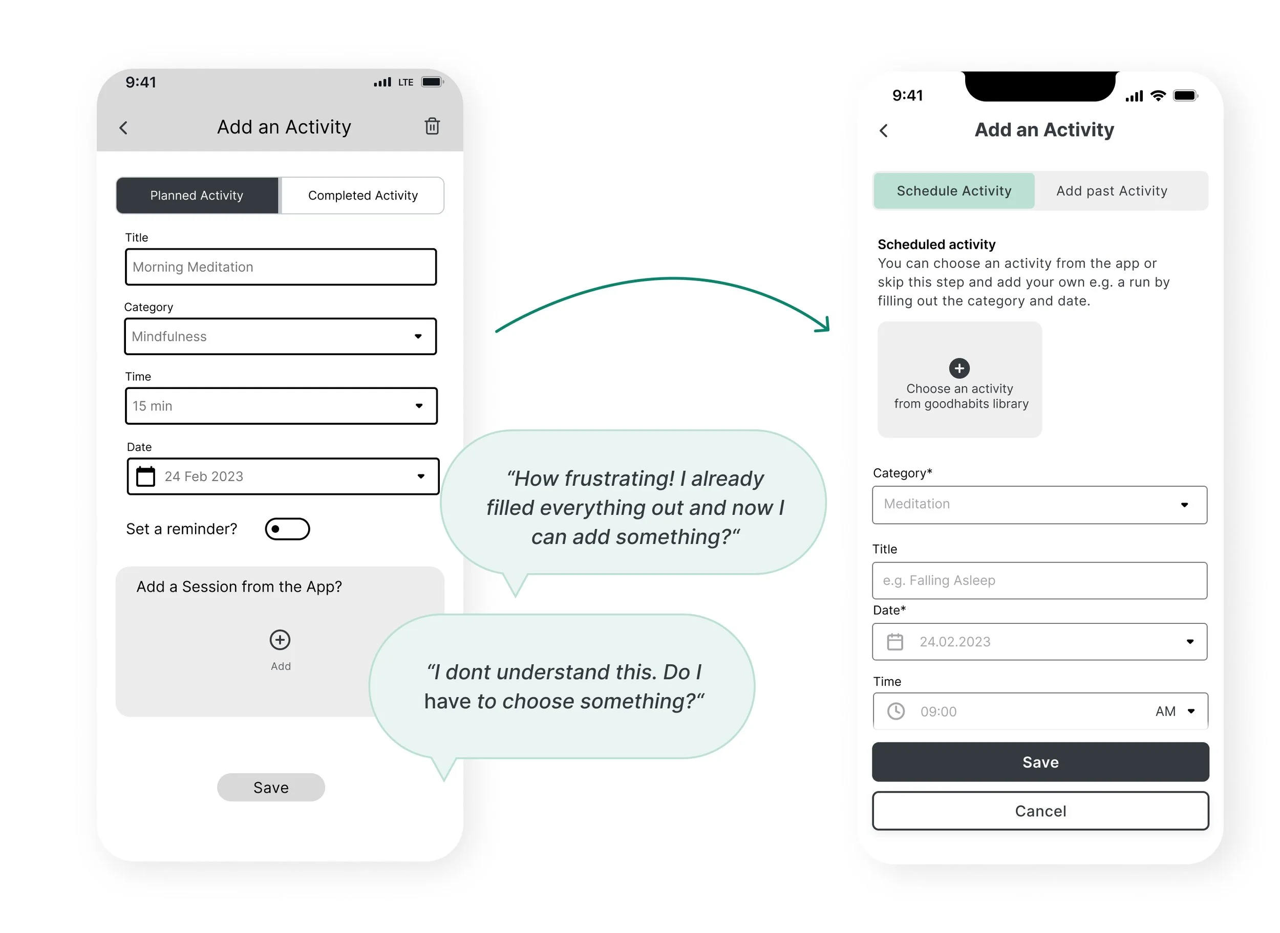
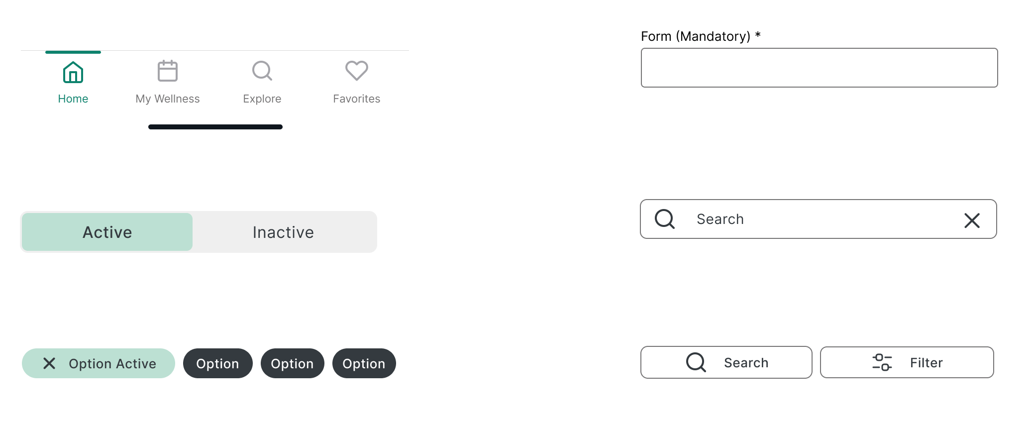
Most participants started typing the form right away and were either frustrated to find the possibility of adding an activity afterwards or didn’t know what to type in the form in the first place. To make things clearer I added a helpful note and changed the order of the elements on the screen. I also added stars to indicate mandatory fields.
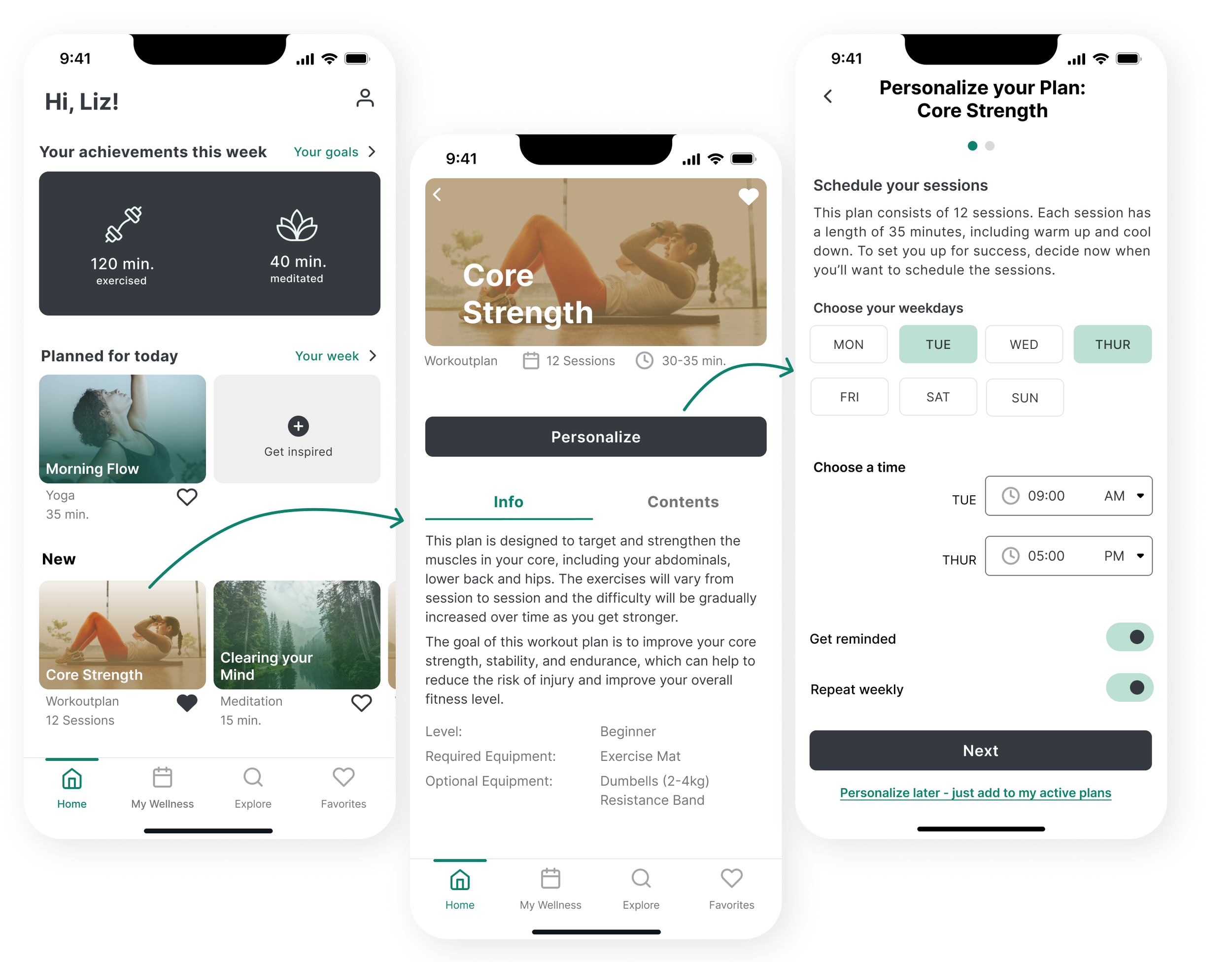
Issue 3: Personalizing a Plan
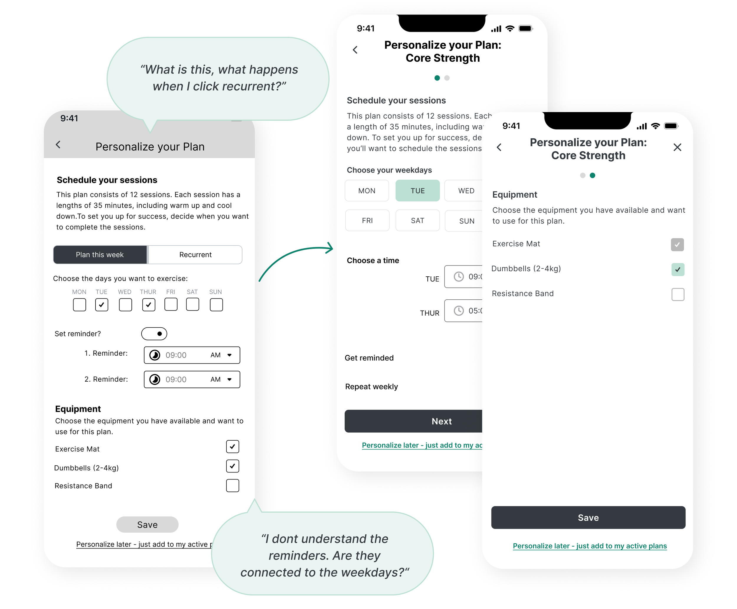
The tab bar was confusing to the participants as they thought the screen beneath would change and they did not understand what it meant. I changed it to a toggle design and adjusted the wording.
Issue 4: Setting a reminder
Participants were also confused by the reminder and if and how they were connected to the selected days. One participant also wanted to choose a time for the workouts without setting a reminder. To solve this I changed the order, design and wording of the elements. I further simplified the screen by splitting it into two.
Wow, this step was so insightful! Surprisingly, the category “Learn”, which was created from the results of the card sort, was not intuitive to participants in the usability tests and therefore was merged with “Explore”. Testing my design and seeing others interact with it showed me what works and what does not. By taking the issues the participants faced into account I hope to have made goodhabits a lot easier and intuitive to use.
Design
Design System
After testing the product it was back to designing. A design system ensures a coherent feel and tone throughout the app and makes navigating it easier for the users. After creating and applying it to goodhabits I gathered peer feedback from 3 designers and made some final changes to the design.
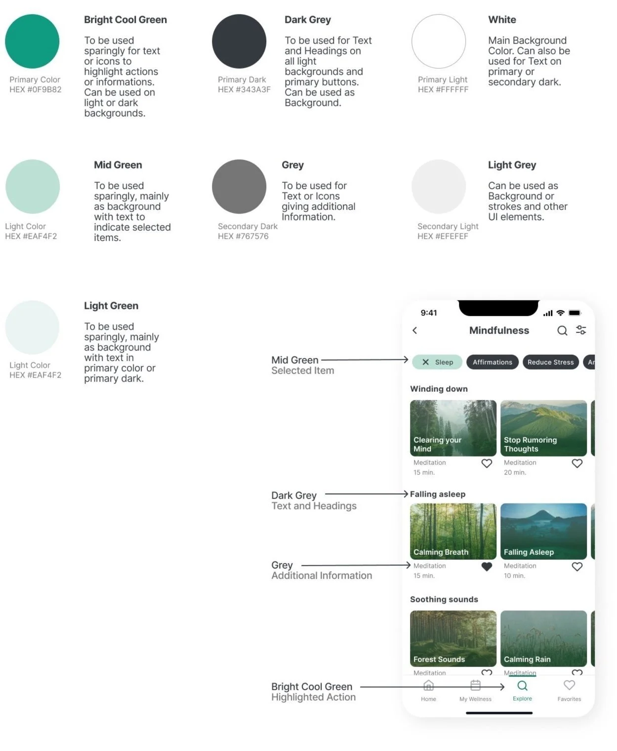
Color Palette
Accessibility
All colours for text were tested with the usual background colours for accessibility, following the Web Content Accessibility Guidelines (WCAG) 2.1. The primary color was adjusted to a darker shade of green to reach a contrast of 4.73. It now reaches AA Level for normal text and AAA Level for larger text.
Logo
Do not use other colours for text or background (Only use on primary dark and primary light)
Do not alter or stretch proportions
Do not use shadows or other effects
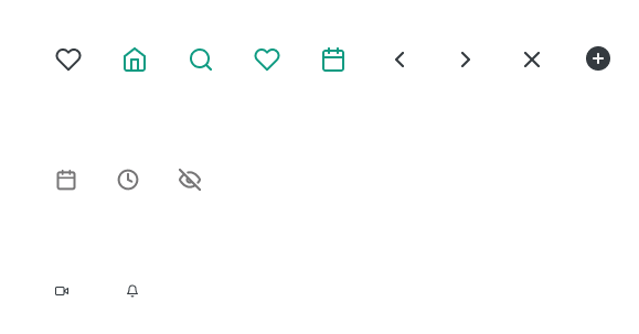
Icons
Icons should be simple and easy to understand. They have to follow these rules:
2px stroke or filled
When clickable: 24x24 px
Only in primary colour and primary dark filled when active
Part of forms or when only for communication: 20x20 px only in secondary dark or 12x12 py in primary dark
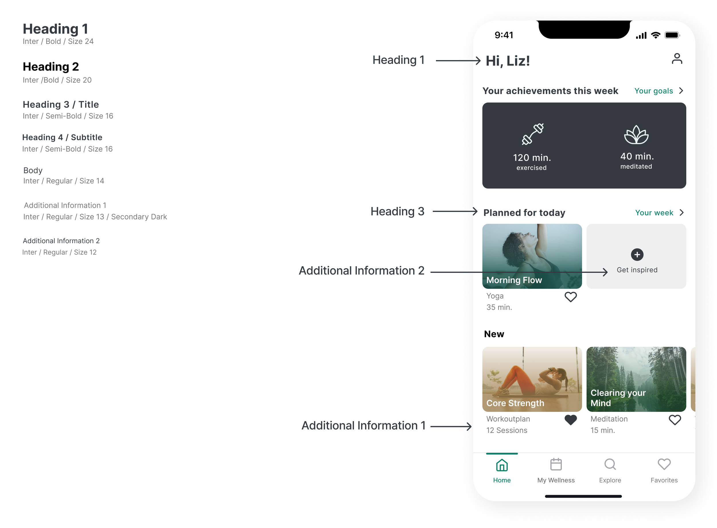
Text Styles
How to use Headings
Heading 1 is to be used on the left in the header for all main pages from the navigation bar. On all other pages Heading 2 is to be used center aligned. Heading 3 is to be used for all other headings.
Grids
Mobile
4-column grid
Margin 16 px
Gutter 8 px
Desktop
12-column grid
Margin 138 px
Gutter 16 px
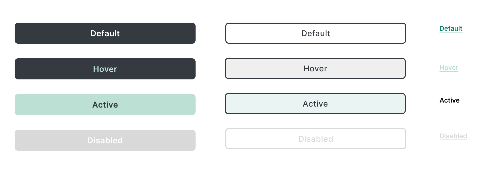
Buttons
Primary
Filled
Size: 359x42 px
Secondary
Outline
Size: 359x42 px
Tertiary
Underlined, coloured text
Inter / Semi - Bold / size 13
UI-Elements
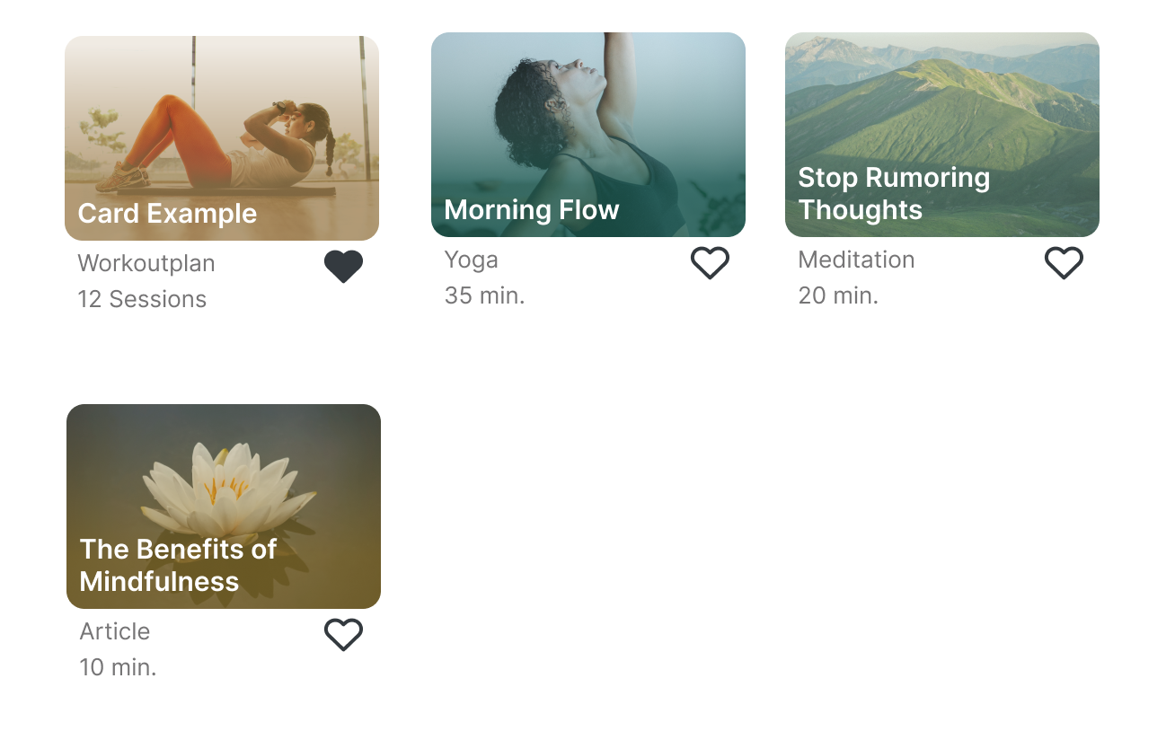
Images / Videos
Use only imagery showing people exercising or doing yoga or landscape imagery for meditation.
Only use for cards displaying activities, not for backgrounds.
Always use with default gradient layer on top for images.
Meditation: 80% opacity: HEX #4D7160 (50%) -> HEX #C7DCD2 (50%)
Plans: 80% opacity: HEX #A08152 -> HEX #A08152 (20%)
Yoga and exercise: 80% opacity: HEX #1E594F -> HEX #96AEAA (12%)
Articles: 80% opacity: HEX #8F6F1E (80%)-> Hex #96782B (23%)
Illustrations
Use sparingly.
Always use the same style and featuring the primary colour.
Final Prototype
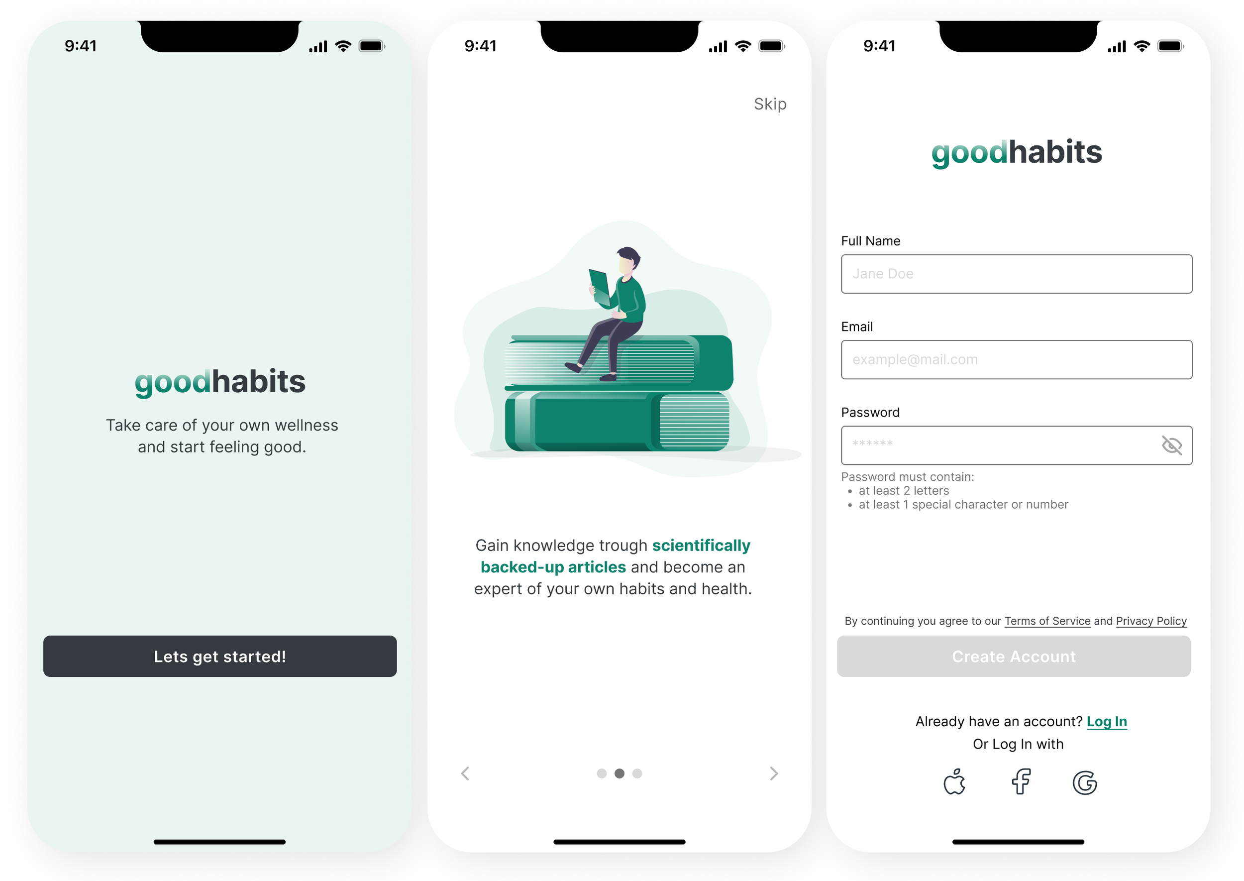
Onboarding
Personalizing a Plan
Scheduling an Activity
Reading an Article
Learnings
My key learnings from this project:
Simplicity is not simple. Making complex matters seem simple needs a lot of thought, work, listening to users and iterations - a process that was challenging but really fun!
Another challenge for me was the user interface and creating the style guide - it was a lot of fun, but I realized that this is an area I want to learn more about and get more confident in.
This project showed me - again - the importance of keeping an open mind and getting input and feedback from (potential) users at different times of the design process. In this example some contents were grouped together in the card sort but when testing the prototype this organization was not intuitive any longer and needed adjustment.

