Learnify - UX-Research Research & Design Sprint
My Role
UX Designer
Tools
Figma, Miro, Keynote, Excalidraw, Google Sheets, Marvel
Time
2 weeks during the Career Foundry UX Intro course
Objective
This project was created during the Intro to UX course as part of the UX Design course I took with Career Foundry. The goal was to conduct UX research for a vocabulary app and create low-fidelity wireframes based on the research results.
Design Process
Problem Statement
People need an app to feel empowered to learn and to facilitate learning new vocabulary, whether when learning a new language or jargon and terms of certain topics.
Possible Solution
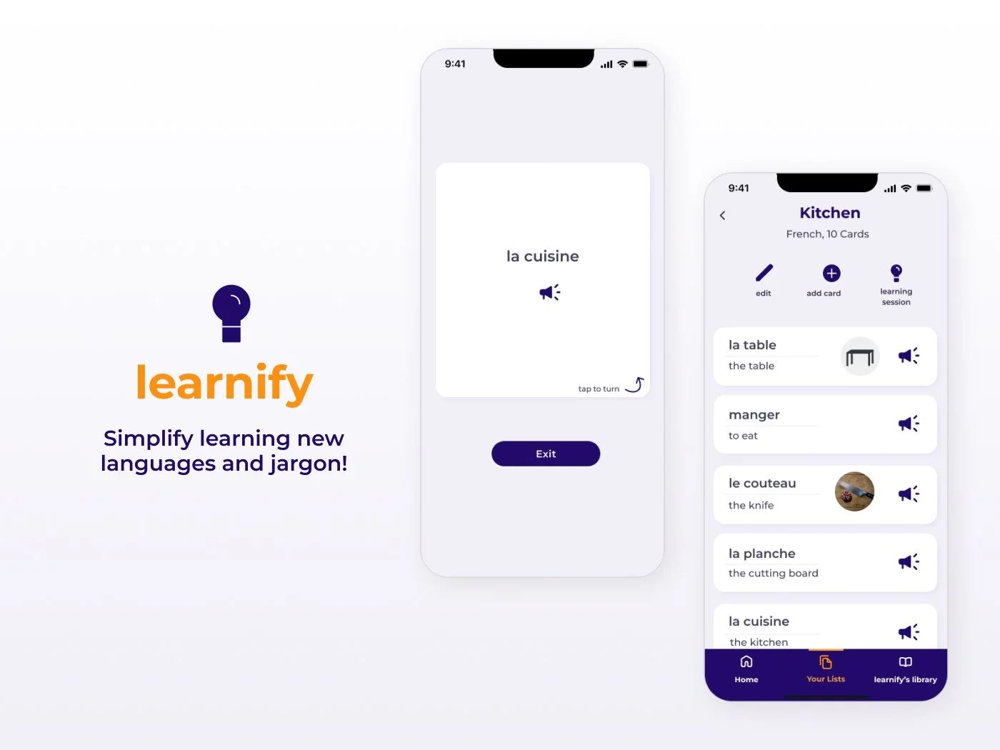
An overall straightforward app that facilitates learning new words with a flashcard-like system. learnify focuses on the user’s goals and is adaptable to their needs while being easy to use and without distractions.
Understand
Week 1
Competitive Analysis
By identifying three main competitors I got a better understanding of the solutions on the market. I took a closer look at what stood out positive or negative. By coming up with possible solutions to the weaknesses,
I discovered opportunities for learnify to stand out.
cabuu
Strengths
Engaging and easy start with no need to create an account
Fun, motivating yet not distracting illustrations during the quick and helpful onboarding
Possibility to create own vocabulary lists or even scan written texts (useful when studying taking a course and using the app to learn for it) or possibility to choose from lists in the (great when learning on your own)
Possibility to make a learning plan (calendar)
The onboarding process is straightforward and setting the app up to start learning your chosen language is quickly done. The user’s goal of finding vocabulary or creating own lists is easy to accomplish.
Weakness
While illustrations/animations in the onboarding process are engaging, when learning they are distracting and confusing
There is no „I don’t know“ option, you have to fill out the field to see the correct answer
Adjectives are not necessary for a correct answer - since they are one of the most challenging parts of some languages this should be.
Some tasks are irrelevant and it is not able to skip them
Solution: fewer illustrations and irrelevant tasks, a more straightforward approach and orientation on real flashcards might be easier to use and less frustrating.
No main overview of the progress, the overview under „Profile“ and Lists“ are confusing and it is unclear how the progress is being marked
Solution: implement a better status overview and the possibility to move words to a „learned“ category.
DuoCards
Strengths
While learning, the flashcards turn by tipping on them, they are sorted by swiping left or right. It feels like learning with real flashcards.
While swiping left or right, a little red or green note indicates what the swipe means ( in case the user forgets)While learning, the way the cards work varies which makes sure you learn all aspects: writing, listening and translating into and from the language you learn. Sometimes you see the word written, sometimes it can be listened to first
Besides the flashcards there are other engaging ways to learn the language: through articles or videos. Words used in articles or videos can be added as a flashcard easily by clicking on them.
Weakness
Onboarding is too long and frustrating: While it is created in a fun and engaging way and it explains the features nicely it takes very long and includes some vocabulary-unrelated tasks like petting „Memo“.
Solution: Illustrations and actions like „pet memo“ that are not related to the goal of the user (learning a language) should be minimized. Also, there might be ways to organize the functions of the app better which would lead to a shorter onboarding
There are some confusing functions that are - despite the long onboarding - not explained and not self-explanatory
Solution: Simplify the App
A main area in which all vocabulary lists are shown and maybe the progress is visualized in a motivating way is missing. The progress that is shown in the app is too small and again the Illustrations of Memo are distracting.
Solution: create a good progress bar/overview
Wokabulary
Strengths
The onboarding process is very straightforward
The structure of the app is easy to understand and orientated on a real flashcard system
It is possible to add tags to the words, great for preparing for a specific event like a test, a vacation or a restaurant visitThe user can also choose a level for each added word
Good overview of all added words with the possibility to filter them by tags or by levelQuiz: it is possible to choose between two kinds of quiz, one classic flashcard quiz where the user can „turn“ the card around and one where the user has to type the answer
When taking the Quiz all memorized words move up a level to show the progress.
Weakness
Every word has to be added by the user and the app does not correct anything and does not suggest translations
Solution: adding the possibility to import or scan lists or implement some lists for the user to choose
Te overall look is not really inviting or motivating, it looks more like a prototype than a finished app
Solution: Improve the UI Elements
When the word in the selected mother tongue is on the front of the flashcard the acoustic version of the translation is as well, but the written is answer on the back.
Solution: only one language per side, written and/or acoustic version
I now understood the market opportunities for learnify:
An overall straightforward approach to make it easy to use, similar to real flashcards
Ability to mark wrongly answered words or to move them into a „learn again“ folderFocus on the user goals and minimize distractions
Include a variety of topics and existing card sets to choose from as well as the ability to create your own lists
Intuitive IA
Present progress in a simple way
User Interviews
After getting an overview of current solutions I formulated Interview questions and conducted three moderated Interviews.
After that, it was time to analyze the data. To better understand the actions, emotions and thoughts of the interviewees I gathered all notes and quotes and divided them into three categories: Doing, Feeling and Thinking.
Doing
I have tried to use different apps for learning languages but didn’t stick to them as they were too cluttered with unnecessary functions or could not be adapted to my own needs
I learn by repetition while going on walks as this works best for me when learning new words
I sometimes forget to learn vocabulary
Visualizing the words is helpful for me too
I mostly succeed in learning everything I plan to learn, I just should start earlier most of the time
I like to prepare my vocabulary knowledge for certain events like going to a restaurant in a foreign country
Thinking
I think it might help to label my flashcards according to how well I remember them, like „works“, „almost“, „got it“
I believe being reminded to learn might help me get started
Being able to share them with my classmates might be good - that way we can study together and I don’t have to add everything myself
I believe the best way to learn for me would be learning by colour-schemed topics with the help of some visualization like photos or my own drawings
I believe it would help me sort them according to the different topics too
Feeling
I feel frustrated when there are too many words in my flashcards that I know already
I feel motivated when I’m recognizing that I begin to understand more complex sentences or articles - testing my knowledge with „real things“
I feel demotivated by simply learning the words - it helps to see them in context
I feel frustrated and overwhelmed when it feels like a big mountain of work ahead of me - a simple design is therefore a must for me
My key takeaways from the interviews:
Participants want to be able to personalize the flashcards e.g. with photos or colours
Participants want to see words in a larger context
The need for an uncluttered app I saw in the competitive analysis was also mentioned in the interviews
Users should be able to give feedback on how well they remember certain words
Ideate
Week 1
Proto-Persona
To be able to solve the user’s problems, I needed to really get into their minds. Meet Lisa!
She represents the findings from the user interviews and helped me to design a useful product. As for this project, the time and resources for extensive research were limited I created a proto-persona to start with.
Lisa
25 Years old
Pronouns: she/her
Based in Münster, Germany
Student
Loves learning new languages and traveling
Wants to learn different new languages as well as specific vocabulary/jargon to prepare for exams or visiting new countries
Needs a little motivation when learning new things
Wants to be able to flexibly adapt the learning platform and organize the vocabulary according to her needs
Challenges
When preparing for exams or starting to learn a new language she can feel easily demotivated and overwhelmed.
When learning a new language for fun she does not always achieve sticking to her learning goals
Problem Statement
Lisa needs a way to learn new technical terms and vocabulary in an uncomplicated yet flexible way because she wants to learn for different purposes like preparing for exams or learning the basics of new languages.
Due to time constraints, the conducted research was too limited to create several personas, but I found having a proto-persona extremely helpful during the following design process. Visualizing findings this way made it easy to keep them at the centre of all further design decisions.
Ideally, I’d have created several personas later on after having gained an even deeper understanding of the end users.
Understand
Week 1
Task Analysis and User Flows
To understand what actions users will need to take in order to accomplish tasks in the app I first decided on the most important tasks the app would have to include so users can reach their goal of learning new vocabulary: Adding a vocabulary list to the saved lists, whether by creating a list or choosing one from the preexisting library and completing a learning session with a list. I then created a task analysis and user flow for them both.
Task & Flow: Adding a Vocabulary List to Saved List
Entry Point
Home Dashboard
Success Criteria
Add a new vocabulary list to saved lists
Task Analysis
Decide between „create your own list“ or "choose one from the library“
Edit or create names/tags/colours for the list
Add or edit the words
Add or edit translations, audio, additional tags and visuals
Save list or start learning
Task & Flow: Completing a Learning Session
Entry Point
Home Dashboard
Success Criteria
Complete a learning session
Task Analysis
Choose language
Choose a list for the session
If needed set a timer for the session
Look at the card & Tap to turn card
Select „knew it“ or „didn’t know it“
Continue or exit
Look at progress visualization
Deciding on the most important tasks, analyzing them and creating user flows helped me to get a good idea of the information architecture of the app, what contents it will include and how to structure them.
I believe the identified tasks will help users learn new vocabulary easily and fit Lisa’s need for a flexible and straightforward app.
Design
Week 1
Wireframes
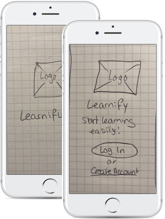
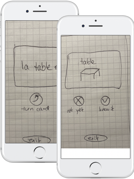
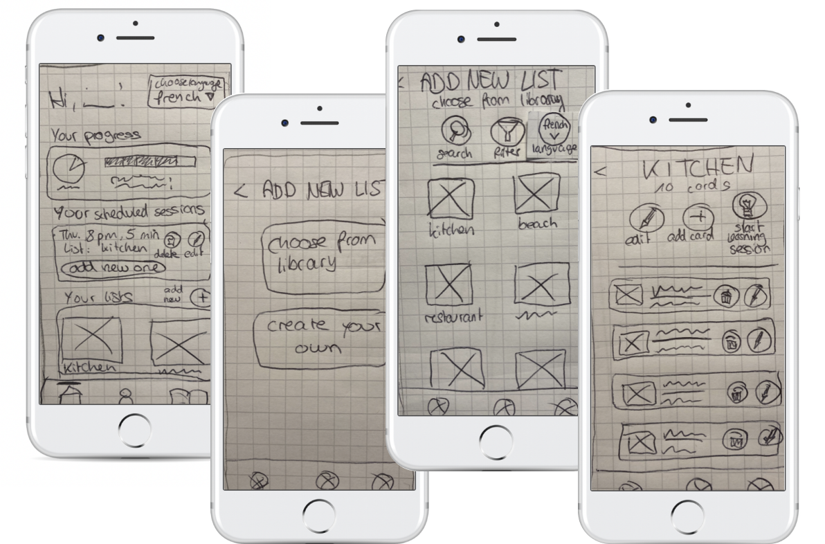
At this stage, I started sketching out the screens of the two user flows and the onboarding with pen and paper to quickly bring different ideas to life and test out the layout and parts of the screens. I then took photos of the low-fidelity wireframes and created a prototype from them using Marvel.
Onboarding
Adding a List
Completing a Learning Session
Test
Week 2
Usability Tests
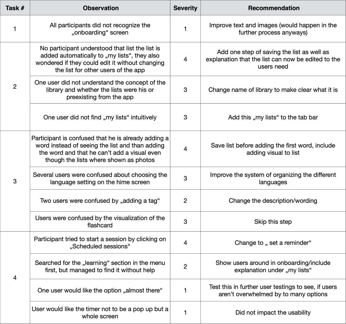
It was time time to test the prototype with real users. Equipped with my usability test plan and tasks for the participants to complete I conducted 3 moderated usability tests using the Think-Aloud method to see how potential users interact with the prototype and find out what works well and what needs improvement. I identified key issues and ranked them using Jakob Nielsen’s error severity rating scale.
Test Plan
Scope
Testing the first prototype of learnify
Session
10-minute sessions with each of 3 participants. The testing will be conducted via Google Meet.
Equipment
Laptop & iPhone
Task Analysis
Skip onboarding and log into the app
Add a new vocabulary list from the library to your saved lists
Create a new vocabulary list with your own learning cards
Complete a 5-minute learning session with the vocabulary list „kitchen“
Participants
Test Report
Jakob Nielsen’s Error Severity Rating Scale
0 = I don't agree that this is a usability problem at all
1 = Cosmetic problem only: need not be fixed unless extra time is available on project
2 = Minor usability problem: fixing this should be given low priority
3 = Major usability problem: important to fix, so should be given high priority
4 = Usability catastrophe: imperative to fix this before product can be released
Changes Made to the Protoype
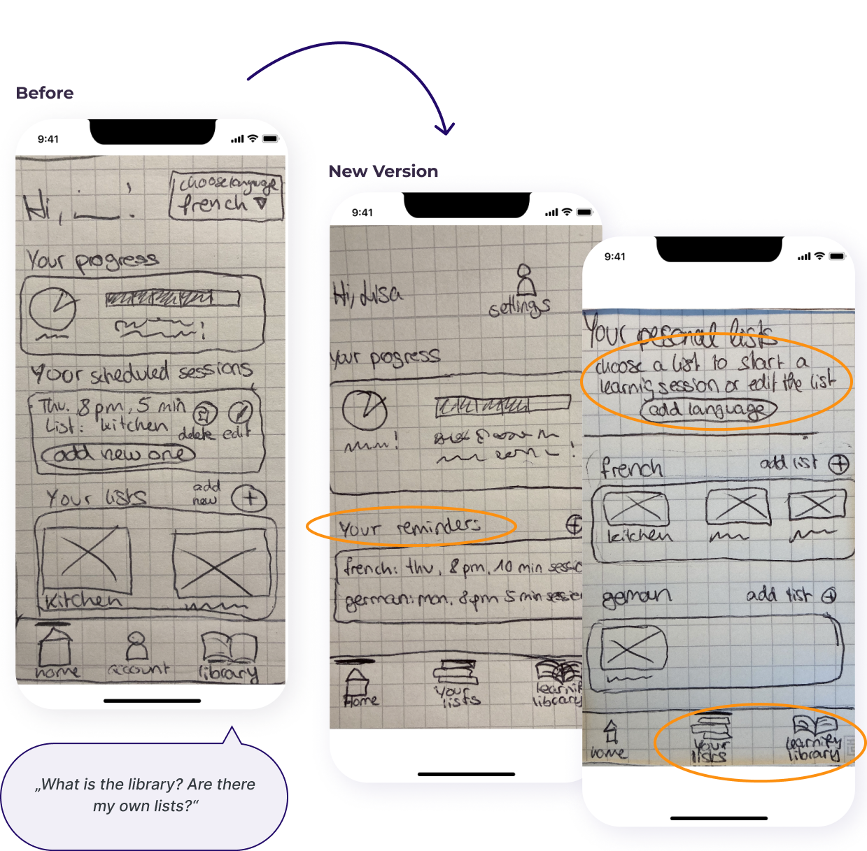
Dashboard & Menu
The menu sections were changed in order to let users find their saved/created lists more easily. The third menu point was named „learning library“ instead of “library” to make clear, that a preexisting library can be accessed. The overall organization of different learning languages has been changed and an explanation was added so the users know better how to start a learning session.
Adding a List from the Library to „My Lists“
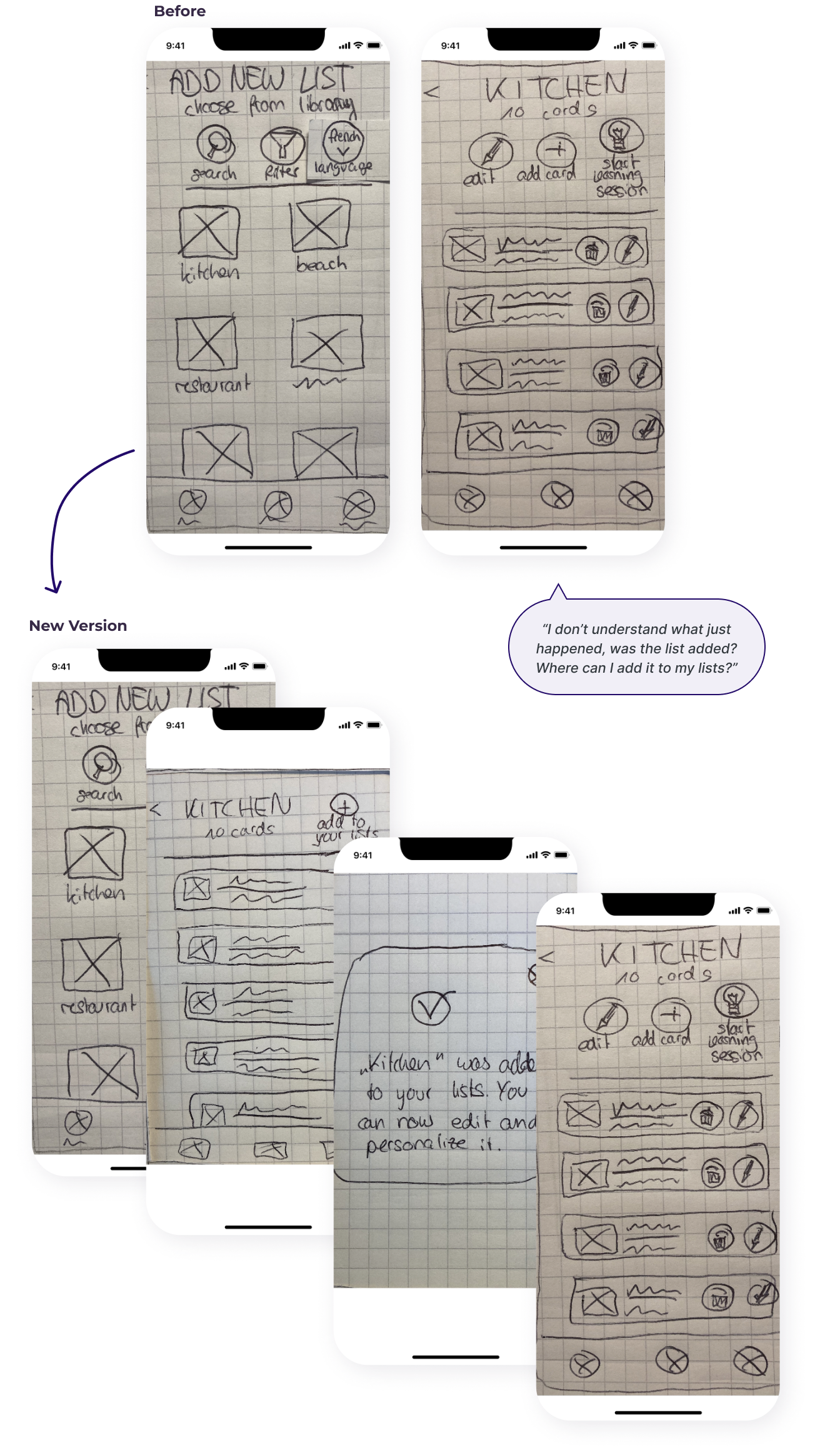
Users were not sure if the list was added or not so I added a step as well as an informative pop-up so the users understand better that the list is being added to their lists and can be edited and personalized by them.
Creating a New List
When creating a new list, the step of showing the empty list was added to make clear, that the list has been created. The ability to add a picture representing the list has been added. As the „tag“ function was not intuitive it is instead possible to add a card to another list as well (e.g. „table“ in „kitchen“ and „furniture“).
Learnings & Outlook
Learnings
Don’t get hung up or distracted by small details but rather embrace the imperfection in the early stages of prototyping
When designing always keep an open mind and verify design decisions by testing them with users
Always keep the user’s needs in mind
A design is never finished but an ongoing process with always room to grow, adapt and improve
Pen and paper wireframes are great for the first versions, for user testing however a digital prototype might make it easier for users to recognize elements or text
If I were to continue...
I’d extend the prototype to include all basic functions and conduct more usability tests with the refined and extended prototype
I’d Implement the results and create high fidelity prototype as well as a design system for a cohesive look
More usability testing would follow, as well as continuous improvements and adding more features to the App
